Abstract
By analyzing existing Web sites, this paper describes design and programming techniques for serving interactive maps to a nontechnical user base. Issues addressed include:
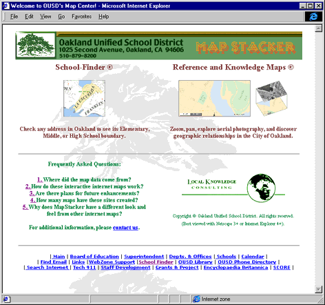
The design ideas that this paper describes come from a collection of MapObjects internet map servers at a community site run by the Oakland Unified School District of Oakland, California, at the following address: http://mapstacker.ousd.k12.ca.us/welcome.htm.
Single-function vs. Multi-function websites
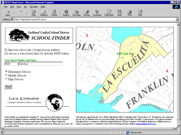
Single function mapping websites serve a single purpose: delivering a map that answers one spatial question. For instance, the Oakland Unified School District (OUSD) School-Finder site shows users where their house is in relation to their elementary school's boundaries. Once School-Finder has delivered this map, it offers no other functionality (such as panning, zooming, identifying, etc.). Because they are so specialized, single-function sites often have few controls or input fields and should, through good design, be easily understandable by an untrained user. What are the specific elements of good single-function site design in School-Finder?
The School-Finder site has some of the elements of good single-function GIS website design. It includes both the question and the answer on the same introductory page. That is, new users see a complete example of what the site does when they first visit the site. First come the written directions (only three steps) followed by the actual text entry fields, then the radio buttons, and then the FIND button, all laid out in the same order as the written directions. The contents of these controls matches the contents of the map beside them which shows the location of "1025 2nd Ave" and the surrounding boundaries of La Escuelita elementary school.
Since map users often prefer to study pictures rather than read words, they seldom read the directions before experimenting with the site's controls. For many users, directions are worth reading only if you get stuck. A good single-function site design supplies directions, but also exposes both the input and output immediately for users who don't read directions first.
Another advantage to combining the question (input and controls) with the answer (a map) is that when the user changes the initial address to another address (his own address), he doesn't lose contact with the controls--they are always bundled with the map. Sites like this one are comforting to the user because they don't jump from one layout to another while performing tasks. The user always has control of the site and doesn't have to learn a new set of controls with every new map.
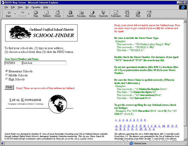
Even single-function sites like the School-Finder are not foolproof. Any GIS website that asks the user to input text is likely to have a variety of potential interpretation problems. Common problems with user-input addresses include inappropriate abbreviations, misspellings of street names, wrong address numbers, use of decimal or fractional addresses, incorrect street type assignment, or combinations of these problems. Well designed single-function sites anticipate the errors that result from user input. When errors happen (not before--remember that users only want directions if they get stuck!) the server should replace the map with suggestions for how the user can correct his input. School-Finder does this and includes specific examples of which addresses succeed and which fail for each sort of problem. It also includes an alphabetical listing of all the street names in Oakland if the user wants to check spelling. This list is only available if the users initial attempt fails. This help screen looks like the following:
In addition to being functionally clear, single-purpose websites are usually very fast at returning maps to users. This is because once a user gets the single map he needs, he has no further use for the site and leaves. In a multi-function website that allows users to pan, zoom, and identify features, the same IMS server has to handle multiple sequential requests from many simultaneous users who may remain at the site for several minutes or more, submitting 10, 15, or 20 different map requests during their visit. Single-function sites escape this heavy demand by doing only one thing and doing it quickly.
Single-function websites, then, are quick, complete, clear, and correct. They are quick because users get one answer and then leave, so the server is seldom busy and returns a consistently fast response to all visitors. They are clear because the directions, resultant map, and links appear on one web page that is easily comprehensible to new users. They are clear; since they only serve one purpose, the need for training is minimal or entirely unnecessary. They are also correct; their design matches their function without the need to compromise for other functions on the same page. According to MapObjects developers at ESRI, single-function websites rank among the most successful public websites using ESRI technology. People understand and use these sites to get the spatial answers they seek.
Multi-function IMS Websites: striking a balance between space, readability, and ease of use
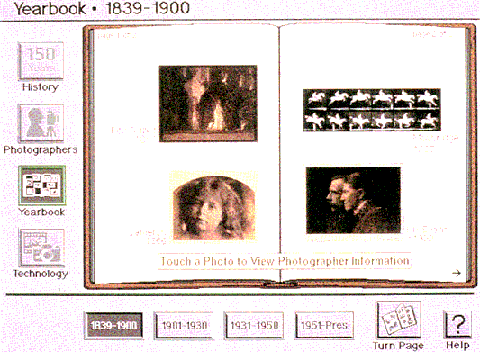
In his wonderful book, Visual Explanations, Edward R. Tufte uses the following Photographer's Yearbook application to illustrate some of his frustrations with poor digital design. Of this work, he says,
"In addition to organizing information by means of analogies to television scripts, bureaucratic structures, software decision trees, and music-television, interface designers have used a metaphor of the book, with viewers flipping through electronic pages. On the screen below, however, the metaphor has become the interface. Only 18% of the space depicts substantive information (photographers and their work); an astonishing 82% of the screen is devoted to computer administrative debris or to nothing at all. In a contrast symbolizing the priority of aparatus over information, compare the elaborately crafted system-icons (why won't just the words do?) with the distinctly clunky typography for the content, the names of the photographers. This spread from the book-parody shows only 53 typographic characters (last names and dates); real books display between 1,000 and 50,000 characters on a double-page spread" (Edward R. Tufte, Envisioning Information, Graphics Press, 1997, pp.149).
Tufte suggests that if digital media designers followed metrics involving the efficient and clear use of space, they might produce more information-rich documents for their viewers:
"These quantitative measurements of the interface indicate how much the design itself has systematically reduced the already inherently low resolution of the 1990’s computer screen (a resolution approximately 5% to 10% of a printed map). Direct measurement of content and non-content provides a quantitative assessment of an interface; these measures of the informational performance of a screen include:
Applied thoughtfully, these measures may help to restrain the spatial imperialism of operating systems and of interface metaphors--and thereby enhance the richness of content displayed. Also such appraisals would make explicit a decision to devote only 18% of a computer screen to information, as we saw for the photographer’s yearbook" (Edward R. Tufte, Envisioning Information, Graphics Press, 1997, pp.149-150).
If we follow Tufte's reasoning when designing interactive GIS websites, one of the main problems our designs must overcome is the severe limitations of space on computer screens and within internet browser windows. Multi-function GIS websites usually contain (1) maps, (2) five to twenty-five or more controls (what Tufte calls "computer administration") that allow the user to manipulate the map, and (3) unused space. To reduce the number of times a user must load new web pages or send a new request to the map server and to increase the overall information content of map-based web pages, a primary design focus of a GIS web designer should be to maximize the map(s) and minimize all else. How can we do this without a loss of overall site quality?
Conserving Space when returning information: the identify-tool and its textual results
Do not limit information-retrieval from a map. That is, if a user clicks the identify tool on a web map, do not give the user the option to identify only certain features of the map. The space required to set up a user-controlled identify-tool is not worth the space lost to producing a larger (hopefully more detailed) map. Instead, return information on all features clicked on. If the information includes extensive information, simply return a hyperlink to that information. Keep the map visible along with the identify-tool's results so that the user can refer back to the map and, if necessary, sort out which features he just identified. The following two sites illustrate a successful and an unsuccessful approach to this design strategy.
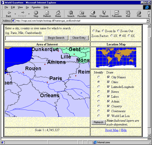
In the World Gazetteer site above, listed in the ESRI sample site listings, an area about one third the size of the main map allows users to choose which feature their mouse-click will identify. When they do click on the main map, the entire site disappears and a new page with a single table of text results appears in its place. Identify-clicks seldom hit more than one feature, rarely two or three. Why not just return the results of all features intersecting the point of the user's identify-click, show them as highlighted on the map, and let the user either click again more precisely if necessary. In most cases, the differences between a city and a water body or a road and a stream are obvious in the textual results if not in the map's graphics, so why waste valuable space on refinements of the identify-tool's functionality?
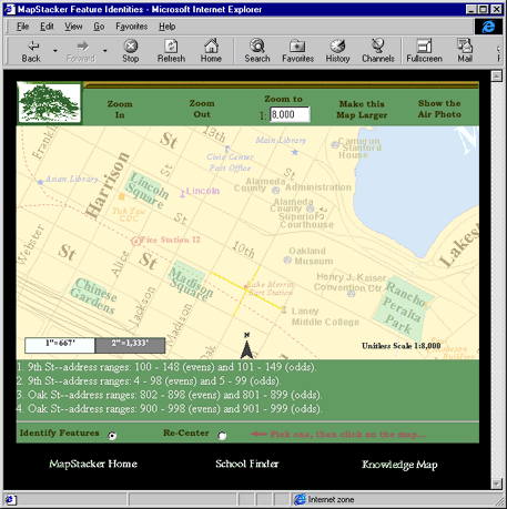
The above sample demonstrates the designer-controlled rather than user-controlled identify-tool results. In this example from the OUSD Reference Map site, the user has clicked on the very center of a four-way intersection just to the right of Madison Square Park, the lower central area of the map. The results of this information-retrieval request are a highlighted map and four lines of text describing each of the four selected streets. If the user needs to know which street is which, he can click again on a single street. If he had clicked on a street that passed through a park, he would have received information on the street and the park. Also, the map and all its controls remain available to the user in case he wants to continue interacting with the map. (In the previous ESRI example, users have to first return to the map page and then begin interacting again.)
Conserving Space with Intuitive Directions
As mentioned in the single-function site description, users seldom read directions unless they get stuck. So why include directions at all? Sometimes the functionality of a multi-function site confuses users and an explanation is appropriate. Good GIS website designs display these explanations as a result of a user-generated event, not all the time. The sudden appearance of a simple message as a result of something the user did makes that message more pertinent and personal to the user. Compare two sites the take opposite approaches to this issue.
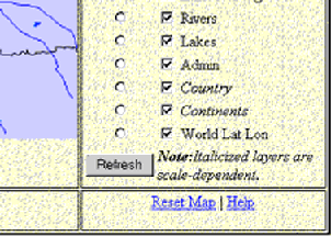
Examining again theWorld Gazetteer site you will find a note to users just below the list of layers: "Note: Italicized layers are scale-dependent." The note is intended to explain why, when users zoom in or out, some map features disappear or reappear on the main map. Typically, directions like these are confusing to everyone except GIS professionals. The average user has to guess what a "layer" is and what the concepts of scale or scale-dependency mean. But what are the alternatives? Users are confused when, following a simple zoom out request, the map content suddenly lacks that river or city which was their reference point one moment ago. How can a design explain scale-dependency without taking up space or being confusing rather than helpful?
The language of a well-designed public GIS website avoids technical and professional jargon whenever possible. Rather than saying "Italicized layers are scale-dependent," the site might instead say "Countries and Continents disappear when you zoom in," or some other specific, non-technical statement. Better yet, the note does not appear at all. In the case of this site, the cartographer ought to be able to produce maps that read clearly at all zoom scales. If certain layers are not included at certain scales, they could be grayed out in the list of choices or replaced with a specific, simple explanation. The following example uses this replacement technique to deliver an explanation to the user.
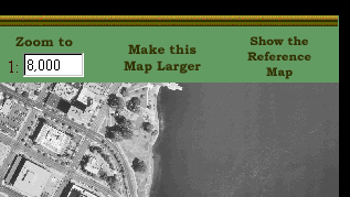
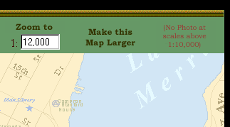
The above two excerpts from the same OUSD website show what happens when a user zooms out from a scale of 1:8,000 (left) to a scale of 1:12,000 (right). The server only generates orthophoto images at scales below 1:10,000. When the scale crosses this threshold, a symbolic "Reference Map" automatically appears instead of a literal "Air Photo." Users previously controlled the toggle between a Reference Map and an Air Photo by clicking on the "Show the Reference Map" text (which then changed to "Show the Air Photo"). When the scale changes and forces an automatic switch of map types, this toggle displays red text saying, "No Photo at scales above 1:10,000." The user sees that something has happened and at the same time gets an explanation. If the event never occurs, the user never needs to know that it might occur. Unfortunately, the explanation uses technical language ("scale", "1:10,000") instead of a simpler explanation. A better wording might be, "Air Photos are only available at close zooms."
Conserving Space with Web Page Organization
Some information is important to your users, but only once. For example, some sites post the number of hits that they have received or the last time their map data was updated. This metadata is relevant and necessary, but is it necessary to include it on the main map page and prominently display it on every map served? Consider two site examples that approach this design issue differently.
The following site from the ESRI samples page superimposes a banner on every earthquake map it serves that says, for instance, "Last Updated at Tue Jul 20 14:14:40 1999." While this may be important information, does it have to be part of every map? What if instead this information was included in the introductory page for this site as a changing answer to a Frequently Asked Question or as part of the map legend?
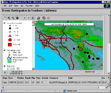
The approach of separating the map from its metadata gives more space both to the map and to the map's metadata. New users should see this separate metadata page before they get to the mapping page; then, when they need to reference it, they know it exists. This is the strategy illustrated by the OUSD site and shown here:
When users visit the OUSD site, they usually want to go directly to the map production pages. However, if they later want to know, for instance, how many hits the site gets or where the map data came from, they can see this information in the Frequently Asked Questions section. Below is a sample from the "How many maps have these sites created?" FAQ that changes everytime a user requests a map from the OUSD servers:
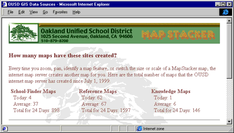
This information does not clutter up the actual mapping site. It supplies more detailed information than the standard single counter does, and is easily readable rather than abbreviated or written in very small type. FAQ's are also easy to expand whereas metadata stored on the same page as the maps can only expand at the cost of space otherwise devoted to the maps themselves.
In addition to removing metadata from the web pages that contain the actual maps, good designs can also remove many of the initial navigation features to a separate web page that users only need to use once when they enter the site. This is the OUSD strategy illustrated in the following web page:
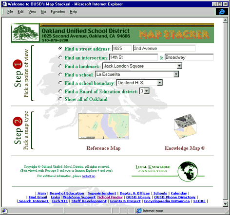
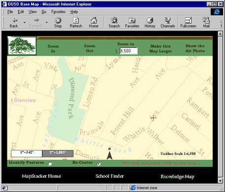
Here, users pick (1) a point of view, then (2) a map type. The point of view is as specific as a street address or as general as the entire City of Oakland. Once the user is viewing the resultant map, he has access to zoom, pan, and identify controls, but no longer needs the point-of-view navigation page. If he does want it, a link is available which returns him to the page. This same sort of navigation strategy appears on radio tuners that have one knob for coarse tuning between stations and another knob for fine adjustments once you are in close range of the station you want. Below is an example of the resultant map view a user sees when requesting the address "4007 Whittle Ave" from the point-of-view page above and then panning the map to the West. Fine-tuning controls are part of the map page; more varied point-of-view controls are not. The user can return to the point-of-view controls or shift to other map types via the links at the bottom of the page. The result is a page devoted primarily to the map itself, not the navigation controls.
Maximizing Website Value with Information-Rich Maps
If the map itself takes up the most space in your website and controls are unobtrusive, the quality of the map (good or bad) becomes obvious. If users don't control which layers appear on the map at different scales, layers should not just unexpectedly disappear from one zoom level to the next. But how can a map with 50 or more layers retain its readability and overall quality at every scale a user requests? And how can map layers with opaque data, like a census block chloropleth map or an air photo, appear simultaneously with other necessary information like roads and labels without being unreadable? Programming techniques allow us to extend the readability of maps at all scales and to increase continuity between displays. Some of these techniques require the extension of MapObjects and Visual Basic with C++ (in cases where Visual Basic is too slow) or with the Win32 Application Programmer's Interface (API), in cases where Visual Basic need the operating system's enhanced functionality.
Programmatic cartographic techniques to increase map readability at all scales
ESRI's MapObjects Internet Map Server tool suite supplies a WebLink method that converts the image in a map control from a windows bitmap (BMP) format to a GIF format. This conversion is necessary for serving web-readable compact image files to your users' browsers. The documentation for this method, the BMP2GIF method, looks like this:
| BMP2GIF
Method --------------------------------------------------------------------------------------------------------------------------------------------------------- Converts a Windows Bitmap file specified by filename into a GIF file of the same name. |
|
| Syntax | object.BMP2GIF filename, interleaved |
The BMP2GIF method syntax has the following parts: |
|
| Part | Description |
| --------------------------------------------------------------------------------------------------------------------------------------------------------- | |
| variable | A Boolean expression that indicates whether the conversion was successful. |
| object | An object expression that evaluates to an object in the Applies To list. |
| filename | A string expression that represents the filename of the Windows Bitmap (BMP) file to convert. The method creates a filename that has the same name as the original file and a .GIF filename extension. |
| interleaved | A Boolean expression that indicates whether the GIF file is interleaved. A web browser will draw an interleaved image in a rough form at first and then progressively render it more clearly as more data comes across. |
| Return
values The BMP2GIF method returns these values: Value Description --------------------------------------------------------------------------------------------------------------------------------------------------------- |
|
| True | The conversion was successful. |
| False | The conversion was not successful. |
| Remarks | In order to use the BMP2GIF method in either an evaluation or the non-evaluation version of the WebLink control, you must invoke the EnableGIF method at the start of your application code, such as in the Initialize or Load event of a form (Form_Initialize or Form_Load in Visual Basic). Follow the procedures included with your product packaging for obtaining a valid license code. |
Not included with the documentation is the fact that the colors in your map control may look different after the conversion to GIF. This is because the map control supports a 256-color RGB palette. The Red, Green, and Blue components of the colors you use for features in your map can have any integer value between 0 and 255. (For instance, you can set your map's roads to be RGB(245,153, 200) and they will appear to be a purplish-red color.) The conversion to GIF changes the 256 color palette to a 216-color palette, also known as a "web palette" that anticipates the potential for limited color displays at some users' sites. Compare the original map with the standard BMP2GIF result:
BEFORE: A MapObjects map-control
BMP image:
AFTER: The same MapObjects
map-control BMP image after conversion to GIF via the BMP2GIF
method:
To overcome this limited color palette conversion, it is necessary to first convert the map control's BMP from a standard windows BMP to an indexed windows BMP and then convert it to a GIF. A pre-indexed BMP will not suffer from the BMP2GIF reduced palette conversion. In essence, pre-indexing sets the palette for the BMP2GIF method and the GIF image looks exactly like the map image. This pre-indexing process simply reads in the original BMP, alters its data structure, and outputs the newly indexed BMP. Performing this structure conversion with Visual Basic proved to be too slow, taking 15 to 20 seconds depending on the size of the incoming BMP. In C++, however, the same process took, at most 1.5 seconds. So how do you weave a C++ program into your Visual Basic server code?
When incorporating an external executable C++ program into your Visual Basic (VB) map server code, one of the challenges is temporarily halting the VB code until the external C++ program is finished doing its job. How can you do this? The following VB code snippet starts the C++ exectuable using the command "Shell." Once the VB Shell command starts the C++ program (here called "RGB2INDX.EXE"), VB continues its own progress while the C++ program executes simultaneously, as a separate but equal process. Several lines later, the VB code encounters the BMP2GIF command--if the C++ code is not finished creating the new indexed BMP, then BMP2GIF will be unable to operate on that new file and, normally, the function would fail and the user wouldn't get any map. However, as noted in the ESRI documentation, BMP2GIF returns a value of false if it fails. The code snippet below uses this return value as a guide; it runs the BMP2GIF command repeatedly (in a continuous loop) until the return-value is true. The VB code only continues running after the C++ code finishes its job and the BMP2GIF command successfully operates on the C++ code's output file.
Dim RetVal
Dim C_Code As String
C_Code = "D:\GIS\OUSD\RGB2INDX.EXE" & " " & strBmpFile & " " & strBmp2File
RetVal = Shell(C_Code)
NewBMPfile = strBmp2File
' The GoAhead loop only completes when the C-code has finished indexing the BMP.
' If Weblink1 can't successfully create a GIF from a correctly indexed BMP file,
' then Weblink1 returns a value of False. On success it returns True and the loop ends.
GoAhead = False
Do While (GoAhead = False)
GoAhead = WebLink1.BMP2GIF(NewBMPfile, True)
Loop
Kill strBmpFile
Kill NewBMPfile
' return image (GIF) file path
CreateMap = WebRef + BaseName + "NEW.GIF"
This expanded range of colors adds a wide range of cartographic levels to your outgoing web maps. A color value gradation of just five or ten RGB levels (e.g. a brightness shift from 245 to 235 in the R value) can subtly differentiate between one area and another. The "BEFORE" picture (above) demonstrates this technique for highlighting the boundaries of the Oakland H.S. District.
If most of the elements in a map have similar values (e.g. light, medium, or dark), the entire map reads as a coherent unit. Maps whose reference features, such as streets, water bodies, or parks, are all fairly light will be excellent backdrops for the main topic of the map--in the case of the OUSD site, the focus is the schools. Compare the following two maps of the same extent. In one, the color values for the schools are approximately the same as the color values of all other map features. In the other, the schools color values are 25% darker than any other features' values. The contrast in value makes the schools the main focus of the map.
Schools' color values are
similar to surrounding map features:
Schools' color values are 25%
darker and have 25% more contrast than surrounding map features:
This subtle use of color value turns one map into two maps displayed simultaneously--a light reference map overlain by a darker topical map, usually a point or line layer. The cartography and design clarify the map's purpose and focus.
Programmatic cartographic techniques to increase map continuity between scales
How can you take advantage of this full RGB palette to increase map continuity between scales? As mentioned earlier in the discussion of scale-dependent layers, the disappearance or sudden appearance of map features from one zoom level to another can disorient and confuse non-technical users. Also, a user may never know that certain features exist at all unless he zooms in to check on them. For instance, minor roads may be visible without labels at a sale of 1:30,000 because labels are only actually readable and placeable at scales closer to 1:15,000. At the 1:30,000 scale, how will the user ever know that labels exist at closer zoom levels?
One solution to the problem of abrupt loss or gain of features between zoom levels is the "Fades" technique. Using “fades” to gradually add or remove themes doesn’t startle users during zooms. Small faded text on minor streets, for instance, lets the users know that the text exists, but the text is faded enough not to distract from the surrounding features. This approximates the effect of slowly stepping away from a poster of a traditional fully-labeled roadmap--you can still see that all the small labels and features exist, but they may not be readable. The further back you step, the more the area features, like parks or water features, becomes prominent.
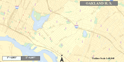
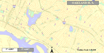
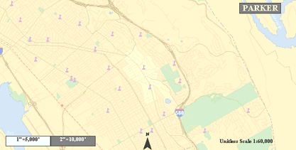
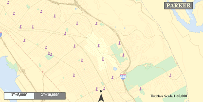
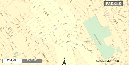
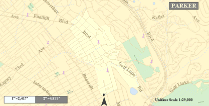
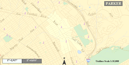
The best way to see examples of this technique is to visit the OUSD site, view a Reference Map at the scale of 1:7,500, and then zoom out repeatedly by a factor of 2,500. As you zoom out, the minor street text shrinks and fades, followed by the major street text, then the minor street lines, etc. Here are a few images to illustrate this shift:
The Parker School District
boundaries at 1:17,500 scale
(minor street labels are visible but unreadable):
The Parker School District
boundaries at 1:29,000 scale
(minor street labels are barely visible due to fade):
The Parker School District
boundaries at 1:35,000 scale
(minor street labels are now gone; major street labels are
beginning to fade and use a lighter, thinner font type):
(Incidentally, a good way to test the quality of your map's cartography is to convert it to grayscale. If the features and labels still read well, you're probably on the right track.)
Programmatically, you can create fades by assigning the renderer objects for your features and labels to a global variable and then altering the render-variable's color, size, or font properties during one of the draw events (BeforeLayerDraw, AfterLayerDraw, etc.). To get scale-dependent colors or sizes, simply divide the scale or one of the map extent values (height, width) by a constant and use the resulting value to set the feature's color or size. For instance, in the OUSD site, the minor street text's RGB color values get higher (and therefore lighter) with the map extent's width. The more users zoom out, the lighter the text becomes. The R, G, and B values are global variables in this case and so can be altered at any point in the program flow.
Simultaneous display of complex maps (extending
MapObjects with the Win32 API)
Some mapping problems cannot be resolved by careful cartographic
manipulation of color, value, and feature sizes. For instance,
even the best single map cannot effectively show a population
distribution chloropleth map over an orthophoto. What techniques
exist for handling 50+ themes in the same display, especially if
some of those themes are opaque and continuous, like an air
photo?
Census data lends itself well to chloropleth mapping, where each area is color-coded based upon a range of values. The ESRI sample site displaying demographics from the City of Ontario illustrates this technique:
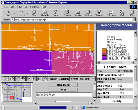
The problem with these kinds of maps is that they restrict simultaneous display of other map information, such as the street network, hydrographic features, etc. In the above example, only the streets and their names, both in white are included. Additional layers would obscure the census information or eachother. The only solution to this overlapping data problem when staying in a single map display is to make census layers or reference layers partially transparent. However, the result sometimes makes both the census data and the reference data both hard to read.
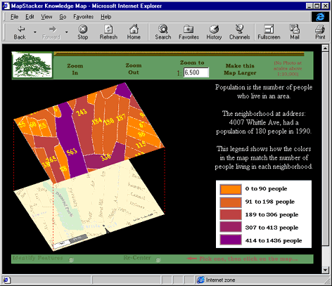
An alternative uses the Win32 API's transformation function, "PlgBlt," within the regular Visual Basic server code to show both the reference map and the census map simultaneously, but offset in 3-D space:
Rotating a map image is not possible using standard Visual Basic or MapObjects commands. The Windows NT operating system does have this ability, however, and to gain access to it, a programmer only needs to declare the API function within his Visual Basic code. I highly recommend Dan Appleman's book: The Visual Basic 5.0 Programmer's Guide to the Win32 API as a source of information on the thousands of API functions available to you as an application developer (see references at end of paper). Here is a description from Appleman's book on the PlgBlt function:
| PlgBlt | |
| VB Declaration | Declare Function PlgBlt& Lib "gdi32" (ByVal hdcDest As Long, lpPoint As _ POINTAPI, ByVal hdcSrc As Long, ByVal nXSrc As Long, ByVal nYSrc As Long, ByVal _ nWidth As Long, ByVal nHeight As Long, ByVal hbmMask As Long, ByVal xMask As _ Long, ByVal yMask As Long) |
| Description | Copies a bitmap, transforming it into a parallelogram. This allows you to rotate a bitmap. |
| Use with VB | No problem. |
| Parameter | Type/Description |
| hdcDest Long | A destination device context for the image. |
| lpPoint POINTAPI | The first entry in an array of POINTAPI structures. The first point corresponds to the upper-left corner of a parallelogram. The second point is the upper-right corner and the third point is the lower-left corner. The fourth corner is derived from the first three. |
| hdcSrc Long | The source device context for the image. |
| nXSrc, nYSrc Long | The x,y coordinate of the upper-left corner of the source image in logical coordinates. |
| nWidth, nHeight Long | The size of the source image in logical coordinates. |
| hbmMask Long | An optional handle to a monochrome mask. If specified, only bits that have a corresponding mask value of 1 will be transferred to the destination. |
| xMask, yMask Long | The x,y coordinates for the upper-left corner of the area in the mask bitmap to use. |
| Return Value Long | Nonzero on success, zero on failure. Sets GetLastError. |
| Platform | Windows NT |
| Comments | If a rotation or shear transform is in effect for the source, the function fails. Use GetDeviceCaps to determine if this function is supported by a device context. |
| Example | BMRotate.vbp |
From this description, the programmer can insert a "declaration" into his VB code that will then make possible references to the API function throughout the rest of the module or project. The declaration for PlgBlt looks like this:
Private Type POINTAPI
x As Long
y As Long
End Type
Dim pts(2) As POINTAPI
Private Declare Function PlgBlt Lib "gdi32" (ByVal hdcDest As Long, lpPoint As POINTAPI, _
ByVal hdcSrc As Long, Val nXSrc As Long, ByVal nYSrc As Long, ByVal nWidth As Long, _
ByVal nHeight As Long, ByVal hbmMask As Long, ByVal Mask As Long, ByVal yMask _
As Long) As Long
Then, later in the program, references to the API function work just like any other standard Visual Basic function call or command. This code fragment demonstrates the use of the PlgBlt command within a VB map server that rotates maps for 3-D stack displays.
Public Sub LOADSTACK()
Dim di&
'Double Horizontal Map Stack
MO1.Map1.OutputMap MapStacker.picBottom.hDC
MO3.Map1.OutputMap MapStacker.picTop.hDC
pts(0).x = 5
pts(0).y = 325
pts(1).x = 345
pts(1).y = 205
pts(2).x = 165
pts(2).y = 510
di = PlgBlt(MapStacker.hDC, pts(0), MapStacker.picBottom.hDC, 0, 0, _
MapStacker.picBottom.ScaleWidth, MapStacker.picBottom.ScaleHeight, 0, 0, 0)
pts(0).x = 155
pts(0).y = 100
pts(1).x = 480
pts(1).y = 5
pts(2).x = 310
pts(2).y = 290
di = PlgBlt(MapStacker.hDC, pts(0), MapStacker.picTop.hDC, 0, 0, _
MapStacker.picTop.ScaleWidth, MapStacker.picTop.ScaleHeight, 0, 0, 0)
MapStacker.DrawStyle = 2 ' lines will be dot-style.
MapStacker.DrawWidth = 1 ' lines will be thin.
MapStacker.Line (pts(0).x, pts(0).y)-(5, 325), moRed
MapStacker.Line (pts(2).x, pts(2).y)-(165, 510), moRed
MapStacker.Line (631, 200)-(505, 390), moRed
This technique works equally well for combining symbolic reference maps with air photos. If the size of the stack seems too small, users have the option to expand the stack, as illustrated below:
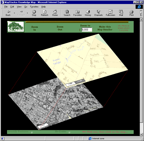
As with other maps at the OUSD site, the zoom commands work as with a normal 2-dimensional map. In fact, all possible functionality has been translated between all map server sites in the OUSD collection. And, if users begin with an address as their point-of-view entry into the site, when they switch between map styles, their original address point remains the focus of the new map style. This decreases the need to re-navigate when switching map views and keeps the continuity strong between sites.
References
Encyclopedia of Graphics File Formats, 2nd Ed., James D. Myrray & William VanRyper, O’Reilly & Associates, 1996.
MapObjects Programmer’s Reference, ESRI, Inc. (issued with software), ESRI, Inc., 1996.
Visual Explanations, Edward R. Tufte, Graphics Press, 1997.
Visual Basic 5.0 Programmer’s Guide to the Win32 API, Dan Appleman, Ziff-Davis Press, 1997.
The Oakland Unified School District map center is available to the public at the following URL: http://mapstacker.ousd.k12.ca.us/welcome.htm.
Local Knowledge Consulting welcomes your inquiries regarding the concepts in this paper or other GIS-related questions. The author, Jonathan Lowe, enjoys collaborating with other GIS enthusiasts. Please call or email! All contact information for Local Knowledge Consulting may be referenced via our website: http://www.giswebsite.com/.